Monday, July 29, 2013

It's Called Imbrication!


At a weaver's estate sale, I picked up a copy of The Virginia West Swatch Book.  It has some lovely weaving ideas and one that clicked with me was a draft that she called Imbrication.  As she explains in the book, imbrication is the overlapping of tiles, scales and shingles. 
 

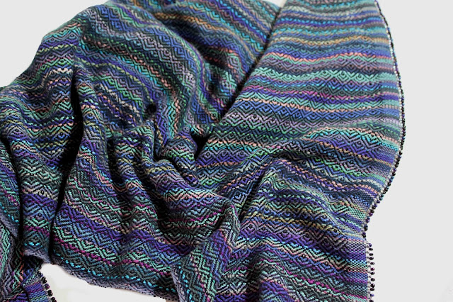
Here is a close up of the shawl I wove using this draft.  I used up balls and balls of cotton dye samples that a friend gave me when she cleaned out her studio and interspersed them with 5 or 6 colors of blues and blue green cotton in the warp. To make the shawl a bit more luxurious to touch, I used one strand of tencel and one of bamboo in black for the weft yarn.  Then, I finished the ends of the warp with a picot bead edge, rather than a plain hem or twisted fringe.

Here is the draft.  The threading can be used on quite a variety of weaving drafts.  Take a look at Double Two-Tie Unit Weaves by Clotilde Barrett and Eunice Smith if you have a copy for ideas.  One thing is that this threading seems to be treadle hungry and you may have to use a skeleton tie up. 

Monday, July 22, 2013

Farey fraction towels


I'm finally getting around to putting up the post that shows the some of variations on the  Farey Fraction Denominator threading.  Some of them are very busy, one or two show a good solid design and some didn't show the complexity of the threading at all.

These towels are all woven on the same warp using different tie ups and mostly a point treadling.  I used an advancing treadling on one towel.


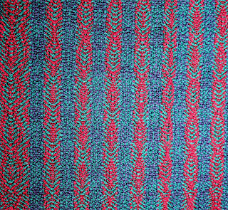
 This is the most elegant design. The pattern is clear and varies across the warp.
 This towel is the end of the warp.  I used up all of the odds and ends of yarn left on pirns. It was interesting to see how the weft color influenced the design.
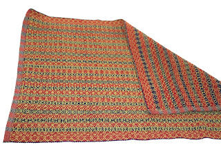
 I actually like this towel a lot.  The pattern shows up in both the red and dark purple areas and it seems almost like embroidery. The reverse of the towel (folded back) shows a redder pattern.
 
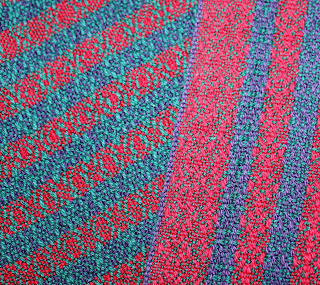
 This close up shows how the design alters across the warp.  The weft color worked well with the warp; always a surprise which wefts are good and those that are just ho hum!


 The towel in this photo shows two very different looking faces.


This was a worthwhile exercise in design work even though my original idea of the red stripe design showing up between bars of dark stripes didn't translate the way I imagined it would.  The main feature of the designs are an embroidery like appearance to the cloth.  However, the designs are small and so detailed, that they can seem overly busy.